Input range นั้นในปัจจุบันยังไม่มีชุดคำสั่งของ CSS ที่เป็นมาตรฐานออกมาให้ใช้ มีเพียงแต่ที่เป็นของแต่ละเว็บเบราว์เซอร์เท่านั้น ทำให้การออกแบบยังค่อนข้างยาก และต้องเขียนซ้ำซ้อน แต่ก็ยังสามารถทำได้. โดยในบทความนี้จะออกแบบให้รองรับ engine ของเบราว์เซอร์หลักแค่ 2 เจ้าเท่านั้น คือ Gecko (Mozilla Firefox), และ Webkit (Google Chrome, Opera, Microsoft Edge).
ส่วนประกอบของ input range
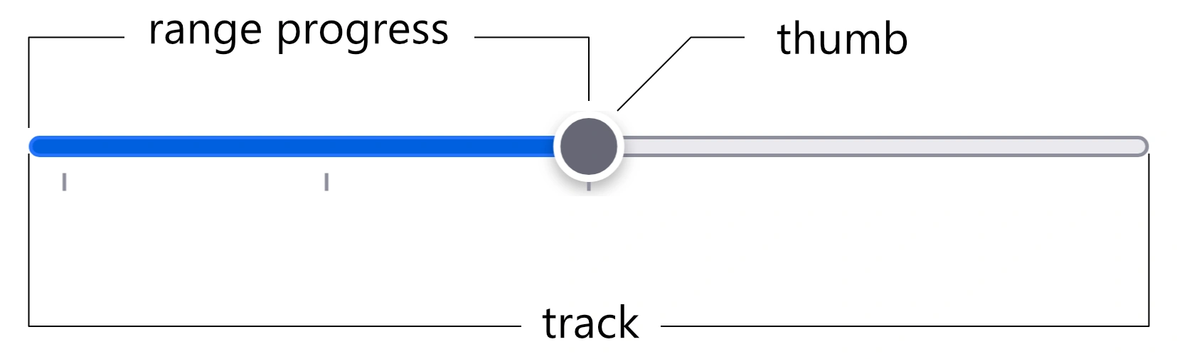
input range นั้นประกอบด้วยส่วนต่างๆ คือ ตัวปุ่มเลื่อนหรือ thumb, ตัวรางหรือ track, ตัวระดับที่เลือกหรือ range progress.
CSS สำหรับส่วนประกอบต่างๆ
ผู้อ่านสามารถคลิกที่ชื่อโค้ดเพื่อตามไปอ่านเอกสารอ้างอิงได้บนเว็บ MDN.
track
ส่วนรางหรือ track นั้นจะใช้ CSS pseudo-element ::-moz-range-track สำหรับ Gecko, และ ::-webkit-slider-runnable-track สำหรับ Webkit. สำหรับคำสั่งที่เป็นมาตรฐานกลางนั้น ยังไม่มีในขณะนี้.
thumb
ส่วนปุ่มเลื่อนหรือ thumb นั้นจะใช้ ::-moz-range-thumb สำหรับ Gecko, และ ::-webkit-slider-thumb สำหรับ Webkit. สำหรับคำสั่งที่เป็นมาตรฐานกลางนั้นยังไม่มี.
range progress
ส่วนที่แสดงระดับที่เลือกหรือ range progress นั้นจะใช้ ::-moz-range-progress สำหรับ Gocko, ส่วนของ Webkit นั้นยังไม่มีตัวเลือกนี้ให้ใช้ในขณะนี้. สำหรับคำสั่งที่เป็นมาตรฐานกลางนั้นยังไม่มี.
ออกแบบ input range
การออกแบบ input range นั้นเบื้องต้นจะแยกออกเป็น 2 ส่วน คือ HTML และ CSS.
HTML
<p><label for="cdex1">Basic</label>
    <input id="cdex1" class="rd-input-range custom-input-range-fixed-width" type="range">
</p>
<p><label for="cdex2">With datalist</label>
    <input id="cdex2" class="rd-input-range custom-input-range-fixed-width" type="range" list="dtl1">
    <datalist id="dtl1">
        <option value="0"></option>
        <option value="50"></option>
        <option value="100"></option>
    </datalist>
</p>
<p><label for="cdex3">Disabled</label>
    <input id="cdex3" class="rd-input-range custom-input-range-fixed-width" type="range" list="dtl1" disabled>
</p>
<p><label for="cdex4">With datalist less than input max (500)</label>
    <input id="cdex4" class="rd-input-range custom-input-range-fixed-width" type="range" list="dtl2" min="0" max="500">
    <datalist id="dtl2">
        <option value="0"></option>
        <option value="50"></option>
        <option value="100"></option>
    </datalist>
</p>
<p><label for="cdex5">With datalist more than input max (100)</label>
    <input id="cdex5" class="rd-input-range custom-input-range-fixed-width" type="range" list="dtl3" min="0" max="100">
    <datalist id="dtl3">
        <option value="0"></option>
        <option value="50"></option>
        <option value="500"></option>
    </datalist>
</p>
CSS
input[type="range"].rd-input-range {
    -webkit-appearance: none;
    appearance: none;
    height: 37px;
    margin: 0;
    -webkit-tap-highlight-color: rgba(255, 255, 255, 0);/* remove white-blue background color on tap or on touch in chrome for android. */
    width: 100%;
}
input[type="range"].rd-input-range:disabled {
    /* this covered beginning part but not for thumb and track at the end. the last part of track will be covered by track selector */
    cursor: not-allowed;
    opacity: 0.5;
}

/* Input range's thumb */
input[type="range"].rd-input-range::-moz-range-thumb {
    background: #eee;
    border: 1px solid #aaa;
    border-radius: 0px;
    box-shadow: none;
    cursor: pointer;
    height: 30px;
    width: 15px;
}
input[type="range"].rd-input-range:active:not(:disabled)::-moz-range-thumb {
    outline: 3px solid rgba(255, 100, 0, 0.3);
}
input[type="range"].rd-input-range:disabled::-moz-range-thumb {
    cursor: not-allowed;
}
input[type="range"].rd-input-range::-webkit-slider-thumb {
    -webkit-appearance: none;
    background: #eee;
    border: 1px solid #aaa;
    border-radius: 0px;
    box-shadow: none;
    cursor: pointer;
    height: 30px;
    margin-top: -14px;
    width: 15px;
}
input[type="range"].rd-input-range:active:not(:disabled)::-webkit-slider-thumb {
    outline: 3px solid rgba(255, 100, 0, 0.3);
}
input[type="range"].rd-input-range:disabled::-webkit-slider-thumb {
    cursor: not-allowed;
}
/* End input range's thumb */

/* Input range track (can't use comma separate for ::-moz-xxx and ::-webkit-xxx) */
input[type="range"].rd-input-range::-moz-range-track {
    background: #eee;
    border: 1px solid #aaa;
    border-radius: 0px;
    box-shadow: none;
    cursor: pointer;
    height: 3px;
}
input[type="range"].rd-input-range:disabled::-moz-range-track {
    cursor: not-allowed;
}
input[type="range"].rd-input-range::-webkit-slider-runnable-track {
    background: #eee;
    border: 1px solid #aaa;
    border-radius: 0px;
    box-shadow: none;
    cursor: pointer;
    height: 3px;
}
input[type="range"].rd-input-range:disabled::-webkit-slider-runnable-track {
    cursor: not-allowed;
}
input[type="range"].rd-input-range:focus::-webkit-slider-runnable-track {
    background: #eee;
}
/* End input range track */

/* Input range progress */
input[type="range"].rd-input-range::-moz-range-progress {
    background-color: #52A0E5;
    border: 1px solid #aaa;
    border-radius: 0px;
    cursor: pointer;
    height: 3px;
}
/* currently not available for Webkit engine such as Chrome, Edge, etc. */
/* End input range progress */
ผลลัพธ์
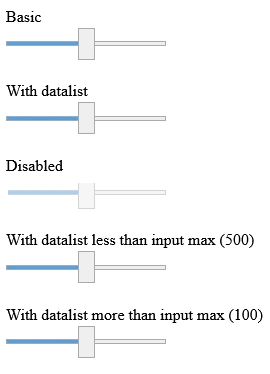
ผลลัพธ์ที่เห็นคือเราจะสามารถเปลี่ยนรูปแบบ input range ได้แล้ว แต่ว่าจะยังไม่สามารถแสดงขีดติ๊กสำหรับ datalist ได้. เมื่อเทียบเคียงกับรูปแบบดั้งเดิมของบนเบราว์เซอร์ Firefox จะเป็นดังรูปด้านล่างนี้.
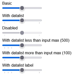
รูปแบบเดิมๆบนเบราว์เซอร์นั้น จะพบว่ามีขีดติ๊กสำหรับ datalist ปรากฏอยู่.
ออกแบบ datalist
การออกแบบ datalist หรือขีดติ๊กนั้น จะต้องมีการใช้ JavaScript เพิ่มเติม เนื่องจากไม่มีคำสั่งใดๆสำหรับ CSS ที่รองรับได้โดยสมบูรณ์เลย. แม้จะสามารถใช้ display flex ได้แต่ก็จะไม่ได้ผลเมื่อ datalist มี option ที่ไม่ได้เป็นระยะที่เท่ากัน หรือไม่สมมาตรกัน ดังตัวอย่าง (คือไม่ใช่ 0, 50, 100 ประมาณนี้ แต่จะเป็น 0, 10, 20 แค่นี้ก็ได้).
HTML
<p><label for="cdirdex1">With datalist</label>
    <div class="rd-input-range-with-datalist">
        <input id="cdirdex1" class="rd-input-range" type="range" list="cdirddtl1">
        <datalist id="cdirddtl1">
            <option value="0"></option>
            <option value="50"></option>
            <option value="100"></option>
        </datalist>
    </div>
</p>
<p><label for="cdirdex4">With datalist less than input max (500)</label>
    <div class="rd-input-range-with-datalist">
        <input id="cdirdex4" class="rd-input-range" type="range" list="cdirddtl2" min="0" max="500">
        <datalist id="cdirddtl2">
            <option value="0"></option>
            <option value="50"></option>
            <option value="100"></option>
        </datalist>
    </div>
</p>
<p><label for="cdirdex5">With datalist more than input max (100) and label</label>
    <div class="rd-input-range-with-datalist">
        <input id="cdirdex5" class="rd-input-range" type="range" list="cdirddtl3" min="0" max="100">
        <datalist id="cdirddtl3">
            <option value="0" label="0"></option>
            <option value="25" label="25"></option>
            <option value="50" label="50"></option>
            <option value="500" label="500"></option>
        </datalist>
    </div>
</p>
CSS
/* Custom design of input range tick marks (datalist) */
.rd-input-range-with-datalist {
    display: block;
}

.rd-input-range-with-datalist .rd-input-range-custom-ticks-container {
    display: flex;
    flex-direction: column;
    justify-content: space-between;
    margin-left: auto;
    margin-right: auto;
    position: relative;
    width: calc(100% - (15px));/* 15 px is input range thumb size. refer from typo-and-form/_form-input-range.css file. */
}

.rd-input-range-with-datalist .rd-input-range-custom-ticks-container > .rd-input-range-custom-tick {
    color: #777;
    font-size: small;
    font-weight: lighter;
    padding: 0;
    position: absolute;
}
.rd-input-range-with-datalist .rd-input-range-custom-ticks-container > .rd-input-range-custom-tick::before {
    border-left: 1px solid #aaa;
    content: "";
    display: block;
    min-height: 10px;
}
/* End custom design of input range tick marks. */
JavaScript
let isListenedInputRangeEvent = false;

/**
 * Custom input range with `datalist`
 *
 * @link https://developer.mozilla.org/en-US/docs/Web/HTML/Reference/Elements/input/range#validation Document reference for default `max` value.
 */
function customInputRangeWithDatalist() {
    const customIRWDClass = "rd-input-range-with-datalist";
    const customTicksContainerClass = "rd-input-range-custom-ticks-container";
    const customTickClass = "rd-input-range-custom-tick";

    // setup tick marks.
    document
        .querySelectorAll("." + customIRWDClass)
        ?.forEach((eachCustomRange) => {
            const eachDatalist = eachCustomRange.querySelector("datalist");
            // get input `max` attribute value. default is 100.
            let inputRangeMax = 100;
            const inputRange = eachCustomRange.querySelector(
                'input[type="range"]'
            );
            if (inputRange.hasAttribute("max")) {
                inputRangeMax = inputRange.getAttribute("max");
            }

            if (
                eachCustomRange.querySelector("." + customTicksContainerClass)
            ) {
                // if there is already generated ticks.
                // remove because we will re-generate.
                eachCustomRange
                    .querySelector("." + customTicksContainerClass)
                    .remove();
            }

            // generate custom ticks.
            // this is for fix that `<option>` tag can't position with CSS.
            let customTicksHTML =
                '<div class="' + customTicksContainerClass + '">';
            for (let i = 0; i < eachDatalist.options.length; i++) {
                const optionValue = parseFloat(eachDatalist?.options[i]?.value);
                customTicksHTML += '<div class="' + customTickClass + '"';
                customTicksHTML +=
                    ' data-value="' +
                    (eachDatalist?.options[i]?.value ? optionValue : "") +
                    '"';
                customTicksHTML +=
                    ' data-label="' +
                    (eachDatalist?.options[i]?.label
                        ? eachDatalist.options[i].label
                        : "") +
                    '"';
                customTicksHTML += ' style="';
                if (optionValue <= inputRangeMax) {
                    // if this option is not more than input range's max value.
                    customTicksHTML +=
                        "left: " +
                        (100 * parseFloat(optionValue)) /
                            parseFloat(inputRangeMax) +
                        "%;";
                } else {
                    // if this option is more than input range's max value.
                    // hide it.
                    customTicksHTML += "display: none;";
                }
                customTicksHTML += '"'; // close style attribute.
                customTicksHTML += ">"; // close opened tag.
                if (eachDatalist?.options[i]?.label) {
                    customTicksHTML += eachDatalist.options[i].label;
                }
                customTicksHTML += "</div>"; // close each custom tick.
            } // endfor; loop datalist's options.
            customTicksHTML += "</div>";
            eachDatalist.insertAdjacentHTML("afterend", customTicksHTML);

            // get max height of each tick and set the heighest number to the container.
            // this is for fixing position absolute cause the container has height zero.
            let maxHeightTick = 0;
            eachCustomRange
                .querySelectorAll("." + customTickClass)
                ?.forEach((eachTick) => {
                    const eachTickRect = eachTick.getBoundingClientRect();
                    if (eachTickRect.height > maxHeightTick) {
                        maxHeightTick = eachTickRect.height;
                    }
                });
            eachCustomRange.querySelector(
                "." + customTicksContainerClass
            ).style.height = maxHeightTick + "px";
            // do not automatically append the `output` HTML element to let dev design their style.
        });
    // end setup tick marks.

    if (false === isListenedInputRangeEvent) {
        // if not listened the input range event yet.
        // listen on slide the input range and show its value to `output` HTML element.
        document.addEventListener("input", (event) => {
            isListenedInputRangeEvent = true;
            let thisInput = event.target;
            if (!thisInput.closest("." + customIRWDClass)) {
                return;
            }
            const customIRWDContainer = thisInput.closest(
                "." + customIRWDClass
            );
            const outputHTML = customIRWDContainer.querySelector("output");
            if (outputHTML) {
                // if there is `output` HTML in the custom input range.
                outputHTML.value = thisInput.value;
            }
        });
    }
} // customInputRangeWithDatalist


// to use: call the function.
customInputRangeWithDatalist();
ผลลัพธ์
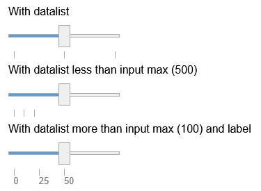
จากผลลัพธ์จะปรากฏขีดติ๊กสำหรับ datalist แล้ว
โค้ดทั้งหมด
เมื่อนำโค้ดทั้งหมดมารวมกันแล้วแยกเป็น HTML, CSS โดยเว้น JavaScript เอาไว้เนื่องจากโค้ดที่เผยแพร่ไว้แล้วด้านบนมีครบถ้วนหมดแล้ว ก็จะได้ดังต่อไปนี้.
HTML
<h2>Custom design of input range</h2>
<p><label for="cdex1">Basic</label>
    <input id="cdex1" class="rd-input-range custom-input-range-fixed-width" type="range">
</p>
<p><label for="cdex2">With datalist</label>
    <input id="cdex2" class="rd-input-range custom-input-range-fixed-width" type="range" list="dtl1">
</p>
<p><label for="cdex3">Disabled</label>
    <input id="cdex3" class="rd-input-range custom-input-range-fixed-width" type="range" list="dtl1" disabled>
</p>
<p><label for="cdex4">With datalist less than input max (500)</label>
    <input id="cdex4" class="rd-input-range custom-input-range-fixed-width" type="range" list="dtl2" min="0" max="500">
</p>
<p><label for="cdex5">With datalist more than input max (100)</label>
    <input id="cdex5" class="rd-input-range custom-input-range-fixed-width" type="range" list="dtl3" min="0" max="100">
</p>

<hr>

<h2>Custom design of input range and datalist tick marks</h2>
<p>This part required JS and custom HTML to work.</p>
<p><label for="cdirdex1">With datalist</label>
    <div class="rd-input-range-with-datalist">
        <input id="cdirdex1" class="rd-input-range" type="range" list="cdirddtl1">
        <datalist id="cdirddtl1">
            <option value="0"></option>
            <option value="50"></option>
            <option value="100"></option>
        </datalist>
    </div>
</p>
<p><label for="cdirdex4">With datalist less than input max (500)</label>
    <div class="rd-input-range-with-datalist">
        <input id="cdirdex4" class="rd-input-range" type="range" list="cdirddtl2" min="0" max="500">
        <datalist id="cdirddtl2">
            <option value="0"></option>
            <option value="50"></option>
            <option value="100"></option>
        </datalist>
    </div>
</p>
<p><label for="cdirdex5">With datalist more than input max (100) and label</label>
    <div class="rd-input-range-with-datalist">
        <input id="cdirdex5" class="rd-input-range" type="range" list="cdirddtl3" min="0" max="100">
        <datalist id="cdirddtl3">
            <option value="0" label="0"></option>
            <option value="25" label="25"></option>
            <option value="50" label="50"></option>
            <option value="500" label="500"></option>
        </datalist>
    </div>
</p>
CSS
/* Custom design input range. ============================== */
input[type="range"].rd-input-range {
    -webkit-appearance: none;
    appearance: none;
    height: 37px;
    margin: 0;
    -webkit-tap-highlight-color: rgba(255, 255, 255, 0);/* remove white-blue background color on tap or on touch in chrome for android. */
    width: 100%;
}
input[type="range"].rd-input-range:disabled {
    /* this covered beginning part but not for thumb and track at the end. the last part of track will be covered by track selector */
    cursor: not-allowed;
    opacity: 0.5;
}

/* Input range's thumb */
input[type="range"].rd-input-range::-moz-range-thumb {
    background: #eee;
    border: 1px solid #aaa;
    border-radius: 0px;
    box-shadow: none;
    cursor: pointer;
    height: 30px;
    width: 15px;
}
input[type="range"].rd-input-range:active:not(:disabled)::-moz-range-thumb {
    outline: 3px solid rgba(255, 100, 0, 0.3);
}
input[type="range"].rd-input-range:disabled::-moz-range-thumb {
    cursor: not-allowed;
}
input[type="range"].rd-input-range::-webkit-slider-thumb {
    -webkit-appearance: none;
    background: #eee;
    border: 1px solid #aaa;
    border-radius: 0px;
    box-shadow: none;
    cursor: pointer;
    height: 30px;
    margin-top: -14px;
    width: 15px;
}
input[type="range"].rd-input-range:active:not(:disabled)::-webkit-slider-thumb {
    outline: 3px solid rgba(255, 100, 0, 0.3);
}
input[type="range"].rd-input-range:disabled::-webkit-slider-thumb {
    cursor: not-allowed;
}
/* End input range's thumb */

/* Input range track (can't use comma separate for ::-moz-xxx and ::-webkit-xxx) */
input[type="range"].rd-input-range::-moz-range-track {
    background: #eee;
    border: 1px solid #aaa;
    border-radius: 0px;
    box-shadow: none;
    cursor: pointer;
    height: 3px;
}
input[type="range"].rd-input-range:disabled::-moz-range-track {
    cursor: not-allowed;
}
input[type="range"].rd-input-range::-webkit-slider-runnable-track {
    background: #eee;
    border: 1px solid #aaa;
    border-radius: 0px;
    box-shadow: none;
    cursor: pointer;
    height: 3px;
}
input[type="range"].rd-input-range:disabled::-webkit-slider-runnable-track {
    cursor: not-allowed;
}
input[type="range"].rd-input-range:focus::-webkit-slider-runnable-track {
    background: #eee;
}
/* End input range track */

/* Input range progress */
input[type="range"].rd-input-range::-moz-range-progress {
    background-color: #52A0E5;
    border: 1px solid #aaa;
    border-radius: 0px;
    cursor: pointer;
    height: 3px;
}
/* currently not available for Webkit engine such as Chrome, Edge, etc. */
/* End input range progress */

/* End custom design of input range. ===================== */


/* Custom design of input range tick marks (datalist) */
.rd-input-range-with-datalist {
    display: block;
}

.rd-input-range-with-datalist .rd-input-range-custom-ticks-container {
    display: flex;
    flex-direction: column;
    justify-content: space-between;
    margin-left: auto;
    margin-right: auto;
    position: relative;
    width: calc(100% - (15px));/* 15 px is input range thumb size. refer from typo-and-form/_form-input-range.css file. */
}

.rd-input-range-with-datalist .rd-input-range-custom-ticks-container > .rd-input-range-custom-tick {
    color: #777;
    font-size: small;
    font-weight: lighter;
    padding: 0;
    position: absolute;
}
.rd-input-range-with-datalist .rd-input-range-custom-ticks-container > .rd-input-range-custom-tick::before {
    border-left: 1px solid #aaa;
    content: "";
    display: block;
    min-height: 10px;
}
/* End custom design of input range tick marks. */
ตัวอย่างการทำงานจริง
คุณผู้อ่านสามารถทดลองดูตัวอย่างจริงได้บน codepen ที่ได้ทำไว้แล้วและนำมาเผยแพร่ไว้ด้านล่างนี้.